
A phone showing the Mind & Brain app's welcome screen, Find the right person to talk to, resting on soft lilac ridges.
Work

LIVE INTERNSHIP / HEALTHCARE

2023

Mind & Brain

A patient app that helps people find the right specialist at a Bengaluru mental-health hospital, without asking them to diagnose themselves first.

PROJECT
Live internship, Mind & Brain Hospital
TEAM
Me and the Head of Operations, with clinicians reviewing
MY ROLE
Sole designer and prototyper (internship)
YEAR
2023

THE PROBLEM

Most people looking for mental-health care don't know which kind of specialist they need, and this hospital offers around 60 services.

WHAT I BUILT

A patient app that asks how you've been, suggests who to see and why, and books you in, with help one tap away on every screen.

THE CONSTRAINTS

The hospital's questionnaire had to keep its wording, because it sends every patient to the right service. Safety questions and a capable adult's consent under the Mental Healthcare Act set firm limits on what the app could do.

WHAT I DID

I led the design and prototyping: flows, interface, the design system, motion and testing, working directly with the hospital's Head of Operations.

WHAT HAPPENED

Five people tested it in person, and the hospital's clinicians reviewed it. Their feedback reshaped the check-in, booking for family and messaging before the designs went to the hospital.

Open the prototype in Figma(opens in a new tab)

The brief

An app to ease the patient journey at Mind & Brain

The hospital wanted a patient app built around its existing screening questionnaire. Instead of ending with a “preliminary diagnosis,” I kept the questions but reframed the outcome to guide users to the right service rather than give them a diagnostic label.

“Our primary objective throughout the app development process was centered on enhancing the patient journey by offering a comprehensive range of accessible features and functionalities.”

The project's goal, as written at the start

What they asked for

They had decided on the five main features of the app

  • A screening questionnaire

    The core of finding care, and the hardest part to get right.

  • Booking and appointments

    Matching, time slots, reminders and a waiting room for online sessions.

  • Chat with doctors

    Messaging with your own care team, with clear rules.

  • Calm tools and articles

    A breathing exercise, and short reads for between sessions.

  • A blog doctors write for

    Articles written by doctors and interns to provide information or knowledge to anyone looking for it.

The hospital's values

What the hospital wanted people to feel

  • Comfort

    Somewhere calm to land when things are hard.

  • Security and privacy

    Knowing who sees what, at the moment it matters.

  • Positive environment

    Things to do between appointments.

Where it started

The first version followed the brief to the letter

Low Fidelity wireframes

What the clinicians changed

Four things they pushed back on

  1. Don't make people pick a profession

    BeforeDoctors were split into Psychologist and Psychiatrist tabs.

    NowMost people can't tell the two apart, so now the check-in suggests where to start.

  2. No results, no diagnoses

    BeforeA test that ends in a result reads like a diagnosis.

    NowNow it ends in a plain-words summary, and a worrying answer gets help on the spot.

  3. No medicine over chat

    BeforeOpen chat let people ask any doctor about medication.

    NowNow messages go to your own care team, with the rules agreed first.

  4. Put a name on health advice

    BeforeBlog posts carried a name and nothing else.

    NowEvery article now shows its author, their role, and when it was reviewed.

The check-in

Making the questionnaire easier to get through

The hospital required every question to remain unchanged, so I redesigned the flow around them. I grouped questions into six time-based sections, added progress tracking, and made Yes/No responses move directly to the next question.

23 questions in 6 sections

  1. Mood and stress

    Six questions about the past two weeks.

  2. Sleep, body and focus

    Five about the past two weeks.

  3. What you notice

    Two about the past two weeks.

  4. The past month

    Five about habits and the body.

  5. Since childhood

    Three about attention and impulses.

  6. Two direct questions

    About safety, asked last.

The intro, a question, the safety screen and the summary.

Where answers lead

Who people see first

  • Mood, stress, sleep or focus

    A psychologist

  • Hearing voices, or feeling others mean them harm

    A psychiatrist

  • Alcohol or substances

    The de-addiction team

  • Childhood attention and impulse traits

    A psychiatrist, for an assessment

  • Either safety question

    A psychiatrist the same day, and a call within 2 hours

Worked out with the Head of Operations.

Key decisions

Five decisions that shaped the app

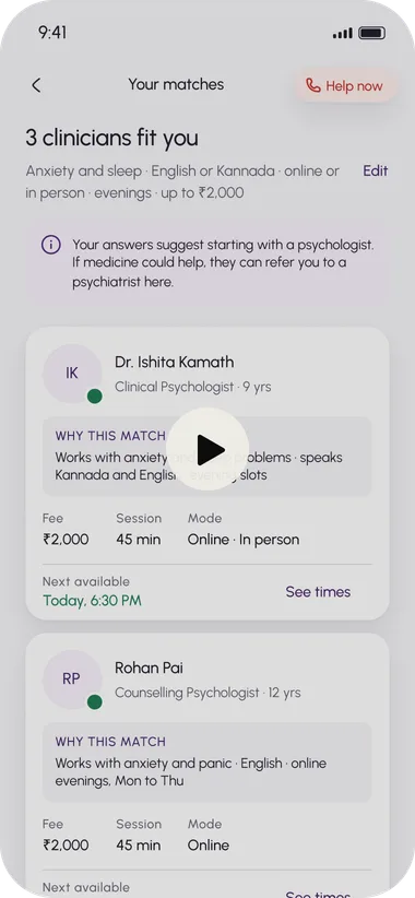
  1. Matched to the right clinician

    Answers and four practical preferences (language, online or in person, time, fee) produce two or three matches, each with a reason in the person's own words. Nobody has to know a psychiatrist from a psychologist.

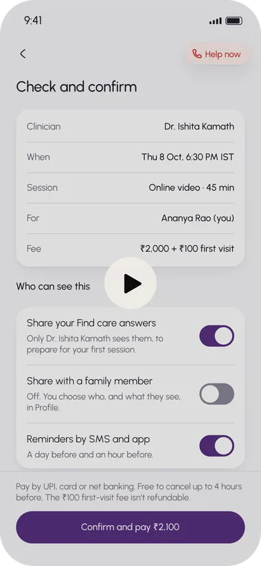
  2. Privacy at the moment it matters

    No privacy wall at sign-up. Privacy appears right before someone shares their answers and names who will read them. Sharing with family is a separate switch, off by default.

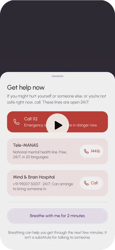
  3. Help now, on every screen

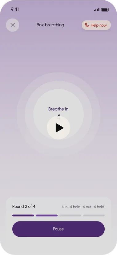
    A red pill in the same spot everywhere, even mid-exercise and mid-message.

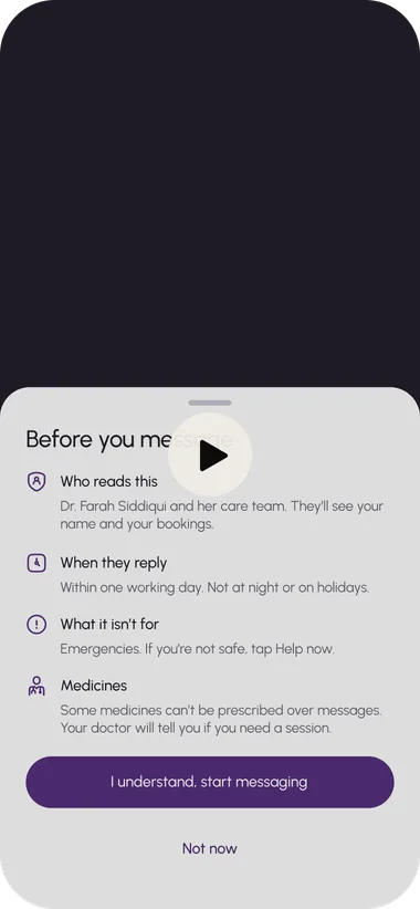
  4. Chat with doctors

    Messages go to your own care team. A short sheet up front says who reads them, when they reply, and that chat isn't for emergencies or medicines. Worrying words bring up the crisis lines before a message sends.

  5. Breathing exercises and blog articles written by doctors

    Box breathing with a circle and a live count, so people can follow without reading. Every article shows who wrote it and when the clinical team reviewed it.

Unhappy paths

When things go wrong

Every unhappy outcome answers the same three questions, in the same order: what happened, is my money and my booking safe, and what can I do now.

  • Offline

  • Wrong code

  • Payment didn't go through

  • Payment pending

  • Time slot taken

  • Hasn't replied

  • Clinician cancels

  • Late cancellation

  • Pending isn't failed.

    The bank may already have taken the money, so the screen says don't pay again.

  • Your answers are never lost.

    The 23 check-in questions survive a failed payment, going offline and a cancellation.

Design system

Building the system

I set up colours, type sizes and spacing as named styles in Figma, with the same names for web and iOS, so a developer can build straight from the file. I also made two components just for the questionnaire: the progress ring and the Yes and No tiles. The app stays light and simple, with shadows only under cards, never inside them.

Colour

  • Hospital purple#552E7E
  • Lavender#F1EAF7
  • Ink#221C29
  • Supporting#3F384A
  • Canvas#F6F5F8
  • Crises and errors red#C23328

Type

  • AaUrbanistEnglish
  • ಕನ್ನಡAnek KannadaKannada
  • हिन्दीAnek DevanagariHindi

Accessibility and care

  • Readability over looks

    A 68-year-old tester struggled with the small privacy text, so I made it bigger and darker.

  • Red is for crises and errors

    Red is only for crises and errors. The Help now pill sits in the same place on every screen. The safety screen names each service and number in words.

  • Contrast that passes

    The palette's text pairs meet WCAG AA: ink on canvas 15.3:1, hospital purple on canvas 9.3:1, white on hospital purple 10.1:1, white on crises and errors red 5.5:1.

  • Three languages in the type system

    English in Urbanist, Kannada in Anek Kannada and Hindi in Anek Devanagari.

Testing

Five people tested the app

  • 5 of 5 found Help now in under ten seconds

  • 5 of 5 read the crisis screen as help

  • 4 of 5 understood the check-in was for matching

  • 4 of 5 knew who would see their answers

“Okay, this is like a mental-health quiz… Oh, it's just using these answers to find someone.”

P4, changing her mind after reading the footer

“Wait. Am I answering what I think she's feeling, or is she supposed to do this?”

P2, stopping at the safety question while booking for her mother

What broke

Testing caught two things

Booking for someone else passed my test and failed the person

P2 found “Another adult” in three seconds, then the questions asked her about her mother's thoughts of self-harm. Now the relative books the practical parts, and the patient answers privately after agreeing by text.

The reason for a match was read last

P1 scanned experience, fee and times before “why this match”. The reason now sits on a lavender panel in body size, so it's read first.

The hospital

Iterating after testing

After testing, I took my open questions on safety, family booking, privacy, payments and brand to the hospital's Head of Operations. The answers changed the design in four places.

  • A risky answer alerts the triage desk

    The safety screen promises a call within two hours

  • A relative's booking holds the slot for 30 minutes

    Payment is held, not taken, until the patient agrees

  • If the patient is too unwell to answer

    A new screen books an urgent psychiatrist instead

  • Answers go to the clinician and triage coordinators

    The privacy line names both

Reflection

What I learned

  • Constraints can improve the solution

    Not every step can or should be removed. Sometimes the better design decision is to make an existing requirement easier to understand and move through.

  • Language is part of the interface

    In mental healthcare, wording can shape how someone feels about what they are seeing. Small changes in framing can make an experience feel reassuring, confusing or overly clinical.

  • Design carries responsibility

    When people may be vulnerable or uncertain, clarity and empathy matter as much as usability. The product has to guide without overstepping what it should claim or decide.

What I'd do differently

Bring patients and clinicians in earlier

I would involve both groups earlier in the process, especially when testing sensitive questions, screening outcomes and how the app guides someone towards the right next step.

What I'd build next

A queue for the triage coordinators

A worrying answer sends an alert, and someone has to call within two hours. A simple queue showing who needs a call, how long they've waited and who's handling it would keep that promise from depending on someone watching an inbox.

“Your professionalism, adaptability, and enthusiasm have made a significant impact on our team and the well-being of our patients. Your positive attitude, passion for learning, and proactive problem-solving approach have been commendable.”
Tariq Rehmani, Head of Operations, Mind & Brain Hospital

Mind & Brain Hospital · Case Study

↑ Back to top
The Sonder Dunes trip planner on a laptop, resting on stone blocks.

Next project

Sonder Dunes

Responsive design · Concept

Work